Overview
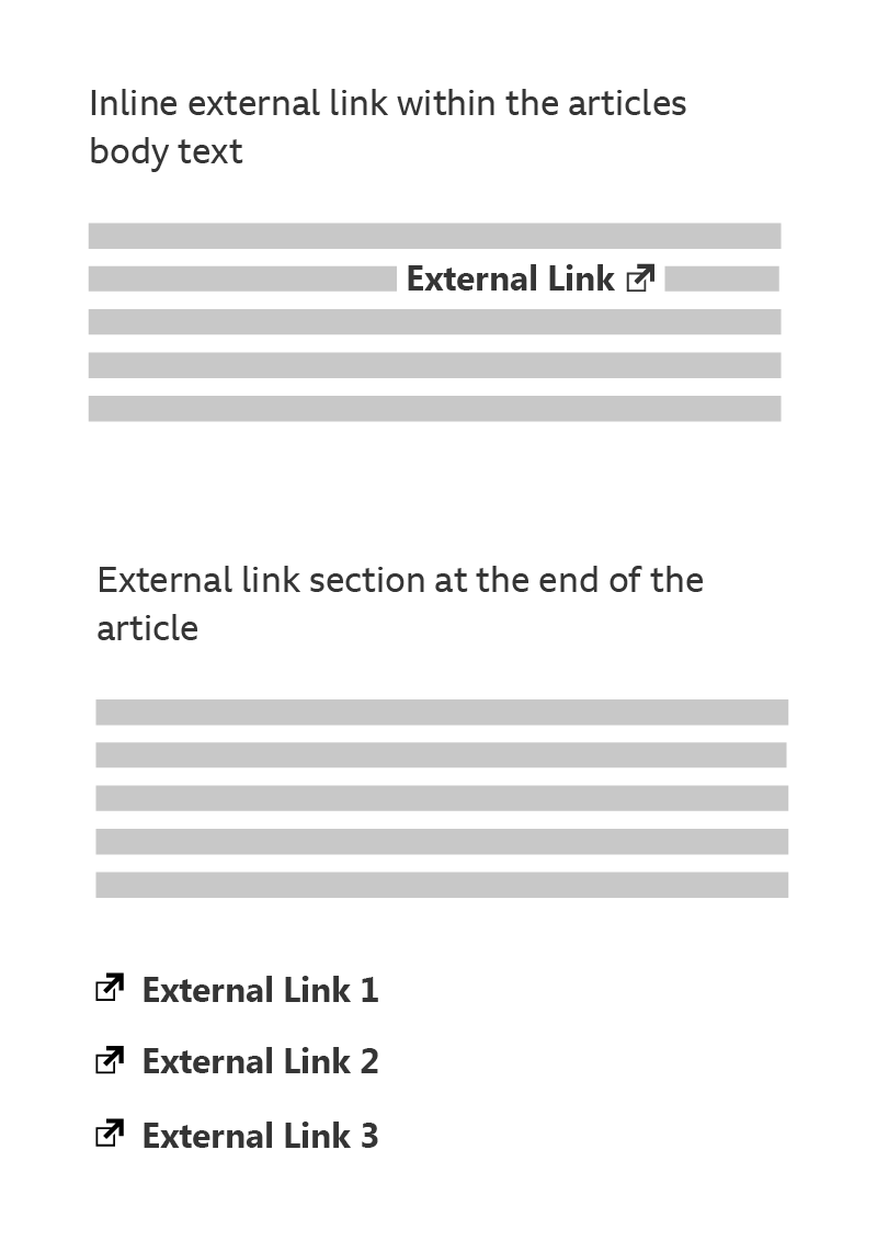
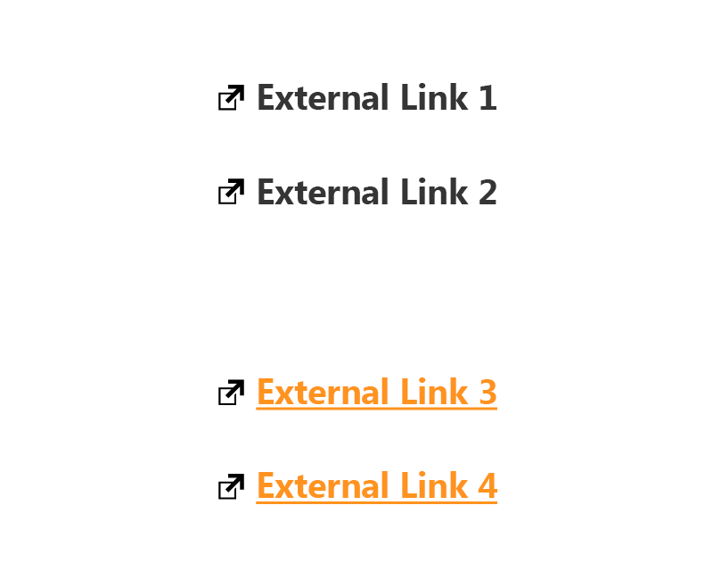
External links can be added inline (within body text) and/or grouped as a list at the end of an article.

How it works
The pattern consists of a text link and a GEL External Link icon, displayed as a single component. Clicking the link should load the external content into the same window or tab, instead of opening a new one.
The icon size should line up with the cap-height of the accompanying text, and both icon and link should always appear as a single component.
Important
Please see Typography for general typographic guidelines, and remember to refer to our touch guidelines for more information on making your designs touch-friendly.
Inline styling
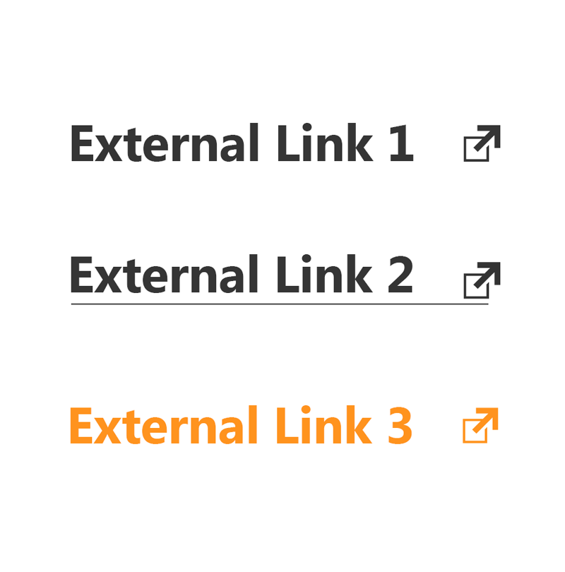
For inline external links, the icon should appear to the right of the text. As a single component, the link’s text and icon will share styling characteristics. These could include underlines, colour changes etc.

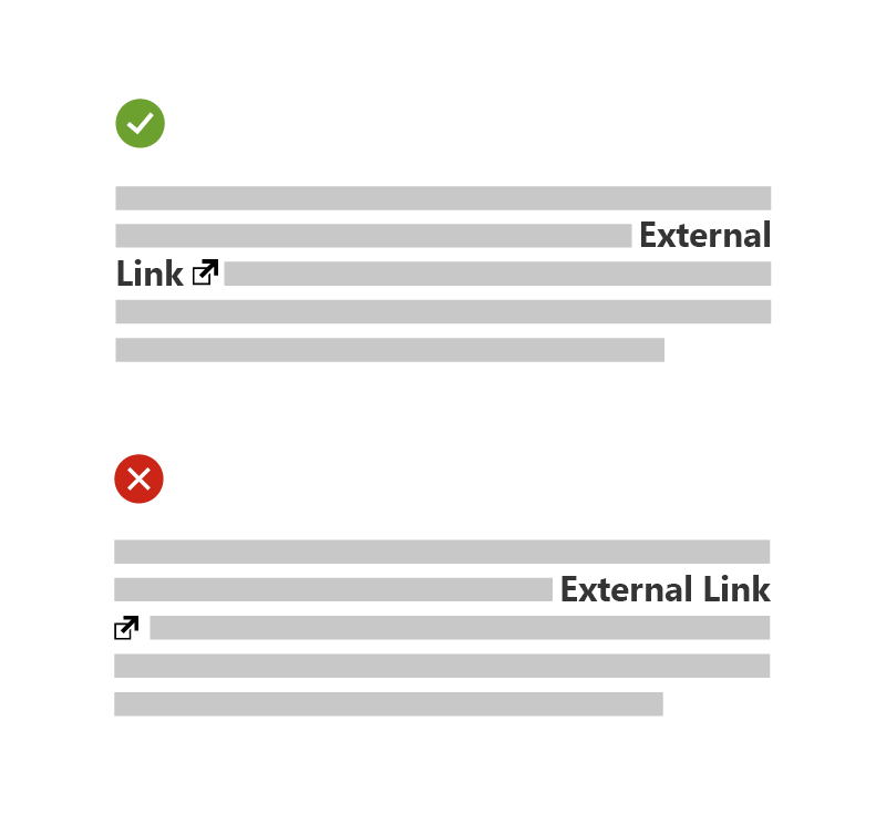
The icon should never be widowed. So, if the icon needs to wrap to the next line, at least one word should wrap along with it.


Accessibility
It’s important to be clear about where a link will take our audience, including visually hidden or suitable alt text within the link for screen readers.
Using the icon in a consistent way across products is best practice, for cognitive accessibility as well as GEL ideals. Consistency between inline links or grouped links at the end of an article is also important.
Our audience should always be informed that they will be moving out of the BBC domain, and exactly which domain they are moving to. This is especially relevant for those with cognitive impairments, or people using assistive technology.