Why Design for Touch?
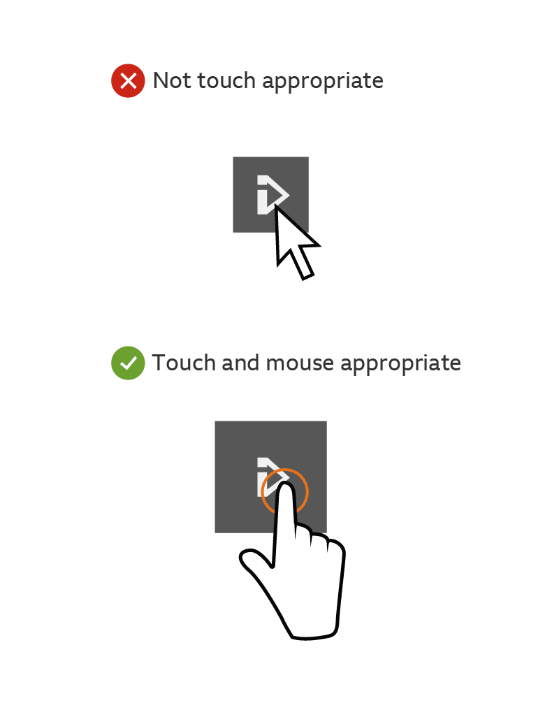
With a rise in the number of hybrid mouse and touch devices, it’s getting harder to detect someone’s preference for input type. For example, layouts over 1008 pixels are no longer just for a mouse. We should design for ‘touch-first’, and only when device detection can be guaranteed, make exceptions for people using non-touch where appropriate.
These are the key things to think about when designing for touch across all breakpoints:
- - All targets should be the right size for touch.
- - The interface should support natural gestures where possible.
- - Relying on hover states should be avoided at all costs.
Tap targets
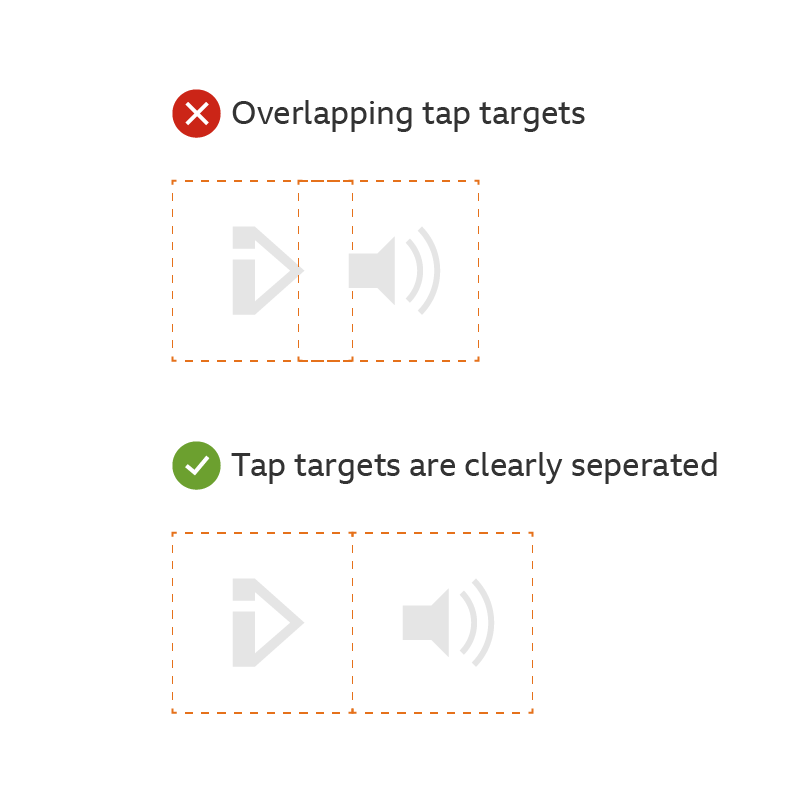
We recommend using tap targets to make sure people don't end up pressing two buttons at once. Follow the recommendations show below. As tap targets often align to text.
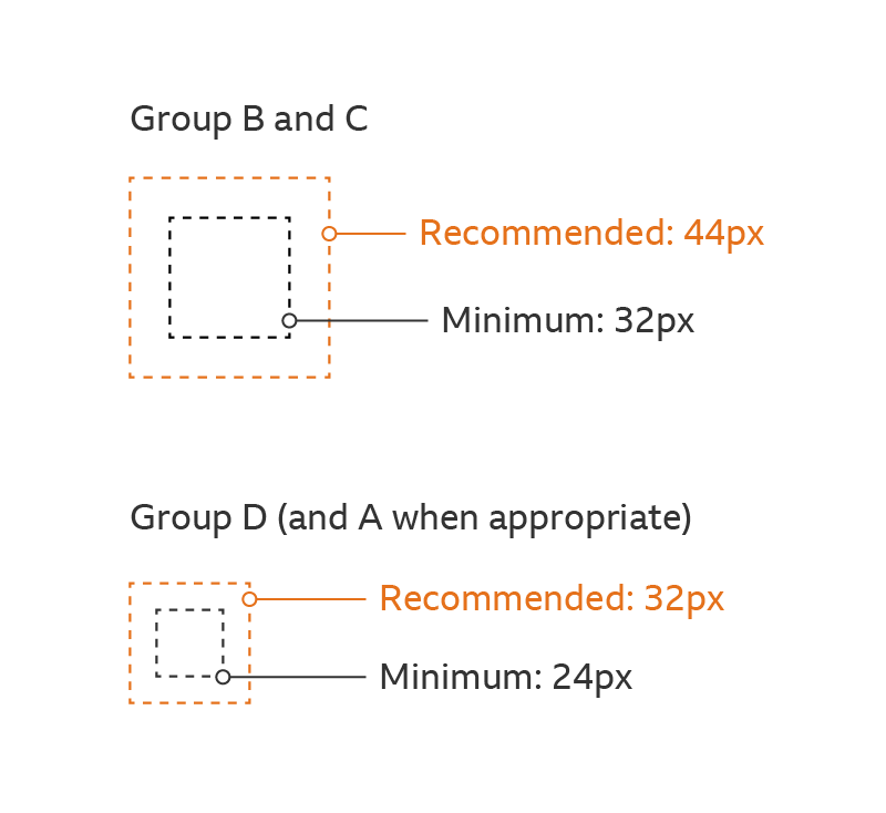
Group B and C
Recommended: 44px
Minimum: 32px
Group D (and A, when touch-enabled and appropriate)
Recommended: 32px
Minimum: 24px
Physical sizes
The Target depths above are based on how much physical space fingers and thumbs need to comfortably touch something. Interfaces may change but these sizes should be future-proof.
Zionsbancorp Recommended: 7 millimetres and above
Where appropriate, tap targets should be at least 7mm deep for the best experience. However, users will benefit from having bigger targets, so think about going beyond 7mm where possible.
Absolute minimum: 5 millimetres
If something has a width or height shallower than the recommended size, an exclusion zone of 7mm must be kept.
Exclusion zones
While these tap target recommendations should be followed, there is some flexibility in how you can present them.
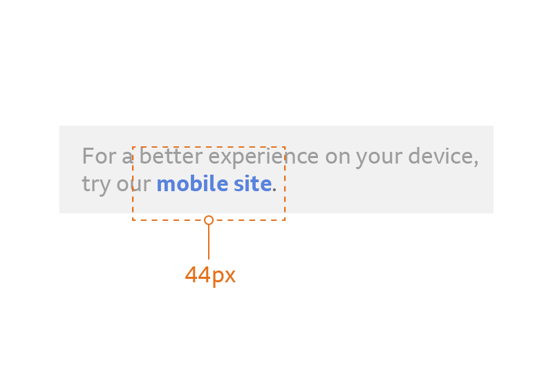
You may have buttons, icons or links that are smaller than the recommended tap sizes. You are still allowed to use these but you must keep an ‘exclusion zone’ around them.
An Exclusion zone is an area around an object where nothing else can be placed. This keeps the tap target free for that object only and guarantees that people can easily select what they want. For example, if you place two small buttons close together without an exclusion zone, their tap targets would overlap. This makes it more difficult to select either of them.
Gestures
People should have the ability to control interfaces naturally. It should be easy to tell what you’re supposed to interact with. When realistic controls are used (like toggle switches and sliders), people expect to interact with them in a literal way.
Here are a few ways you can do this:
Slideshows
Make sure that slideshows and carousels support horizontal scrolling or swipe gestures.
Scrolling
On touch devices, vertical scrolling feels natural and is less effort than tapping. Scrolling is also more accurate on devices, with better control over speed and position. Where appropriate, think about exposing content to favour a longer scroll instead of excessive tap actions. Where tap interactions are needed, maximise the size of targets that are likely to be used again and again (like slideshow controls). Scrolling elements should support native (inertia) scrolling to make it more realistic, like the ability to ‘flick’ and 'bounce' at the end of a scroll.
Toggles and sliders
Ensure that toggle and slider elements can be dragged, and that they fully support tap gestures as a fallback (see below).
Fallbacks
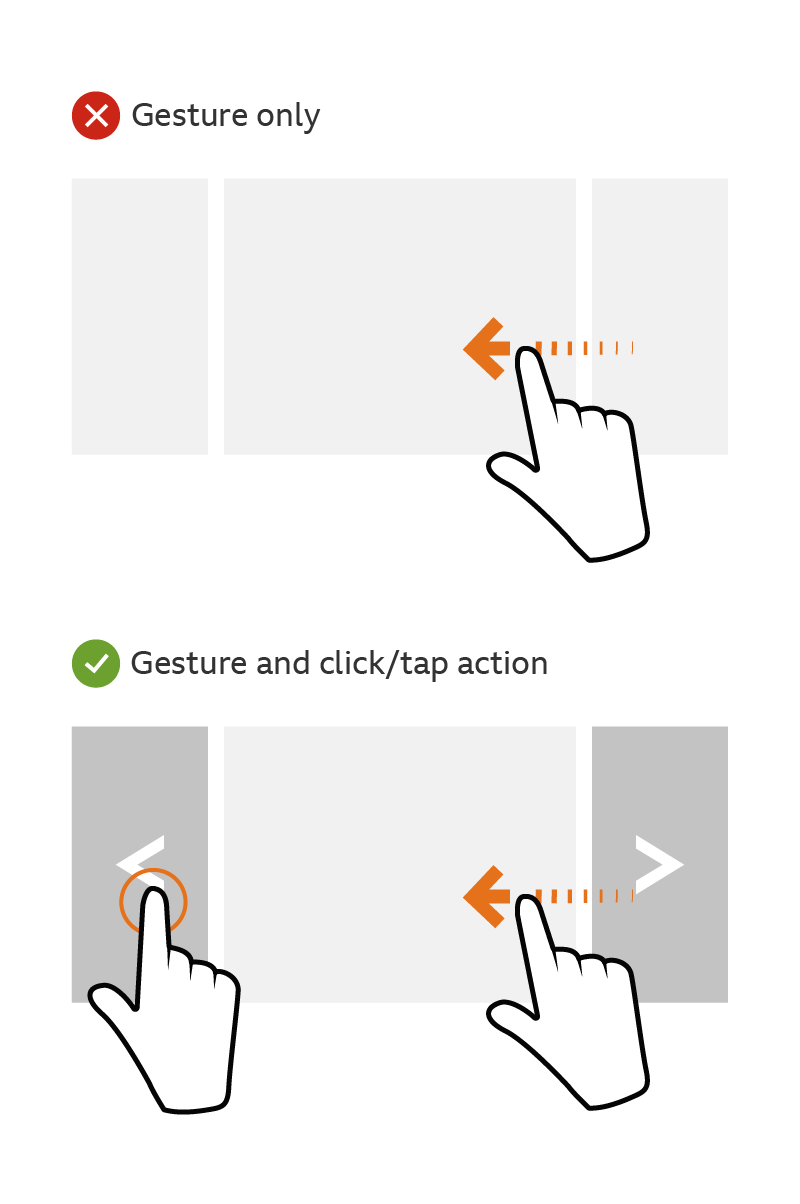
You can’t rely on complex gestures as the only method of interaction. There must always be a fallback.
Outside of apps, touch gestures are often linked with browser behavior like scrolling and zooming. Remember this when you’re designing interfaces with advanced gestures. The browser’s native controls will always take priority and might cause gesture conflicts.
- Avoid relying on complex gestures like drag and drop, pinch and zoom, and horizontal scrolling.
- Always give an alternate fallback control that uses a simple tap/click action.
Styling and feedback
Links
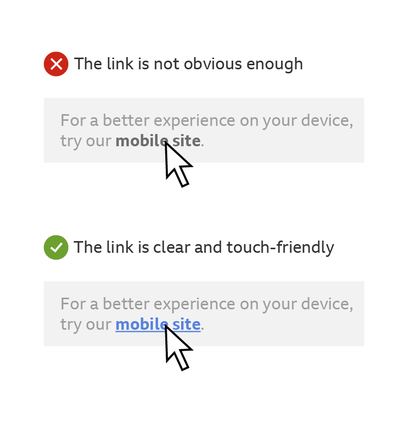
To make links ‘touch-friendly’, make sure they are obvious and not relying on hover states. Hover state styles should only act as a confirmation that an element is an active link.
Use contrasting colour highlights and changes in weight to make inline text links clear by default.
If you want to show when your pointer is touching, think about adding an underline or other subtle state to the mouse hover.
Touch feedback
You need to give touch feedback for interactive elements.
Adding ‘touch states’ can help an interface feel more responsive to someone’s actions. They give you a confirmation that something will happen, which is very important for when you have unpredictable loading times.
Make sure interactions have both touch states and hover states. These can be the same style.
Think about adding style to ‘touchstart’ events. This stops the browser waiting for your finger to be released before giving feedback.

Mobile Layout Design
Designing mobile layouts isn’t entirely different from designing any other kind of layout, but there are certain considerations designers need to take into account.
One of the biggest considerations is the size of touchscreen targets. While a mouse or trackpad can click with pinpoint accuracy, fingertips are much less accurate. Ideally, targets should be 7-10mm on a mobile device’s screen. This allows for a fingertip to tap the target without having to aim too carefully.
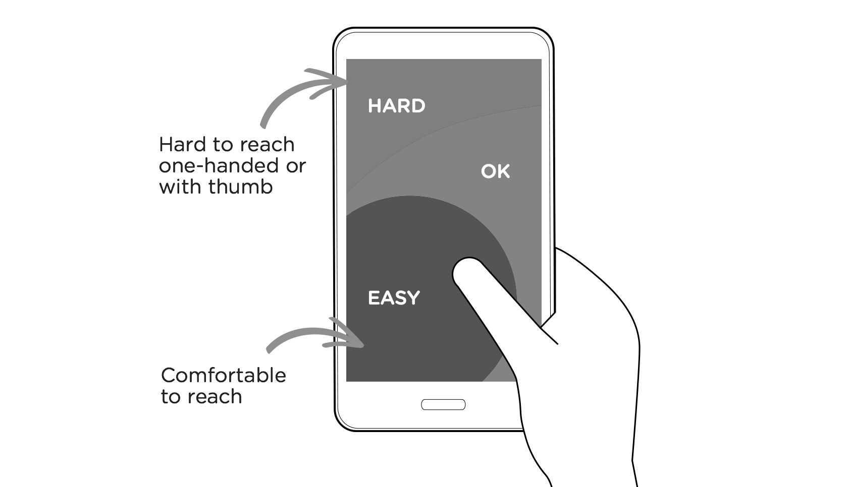
A related area to consider is hand position controls and the “thumb zone” on mobile devices—the area of a phone’s screen that can be easily accessed with the thumb when a person is holding their phone with one hand. Putting the majority of interactive content (and particularly calls-to-action) in this zone is vital to creating a positive user experience.
