Overview
The Bootstrap 4 grid system has five classes used in creating a "Responsive Grid".
Bootstrap 4 Grid System Layout
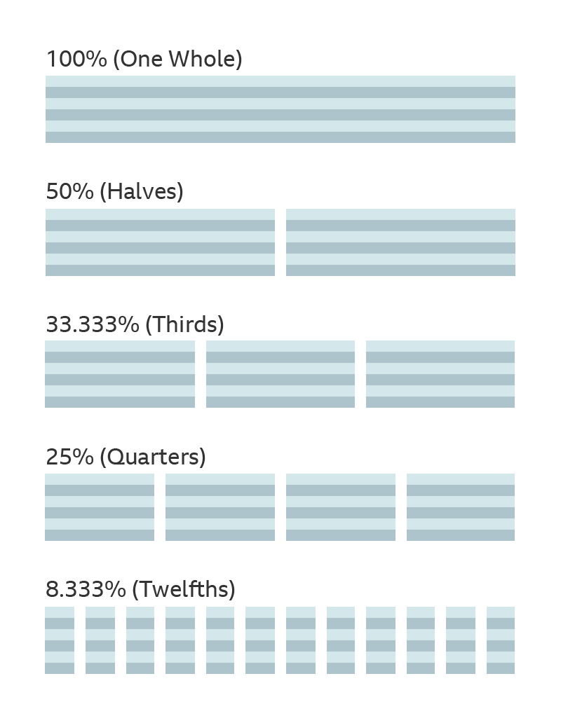
Bootstrap's grid system allows up to 12 columns across the page.
If you do not want to use all 12 column individually, you can group the columns together to create wider columns:

Grid Classes
.col-(extra small devices - screen width less than 576px).col-sm-(small devices - screen width equal to or greater than 576px).col-md-(medium devices - screen width equal to or greater than 768px).col-lg-(large devices - screen width equal to or greater than 992px).col-xl-(xlarge devices - screen width equal to or greater than 1200px)
The classes above can be combined to create more dynamic and flexible layouts.
Tip: Each class scales up, so if you wish to set the same widths for
sm and md, you only need to specify sm.
Grid Options, Spacing and Layout
| Extra small (<576px) | Small (>=576px) | Medium (>=768px) | Large (>=992px) | Extra Large (>=1200px) | |
|---|---|---|---|---|---|
| Class prefix | .col- |
.col-sm- |
.col-md- |
.col-lg- |
.col-xl- |
| Grid behaviour | Horizontal at all times | Collapsed to start, horizontal above breakpoints | Collapsed to start, horizontal above breakpoints | Collapsed to start, horizontal above breakpoints | Collapsed to start, horizontal above breakpoints |
| Container width | None (auto) | 540px | 720px | 960px | 1140px |
| Suitable for | Portrait phones | Landscape phones | Tablets | Laptops | Laptops and Desktops |
| # of columns | 12 | 12 | 12 | 12 | 12 |
| Gutter width | 30px (15px on each side of a column) | 30px (15px on each side of a column) | 30px (15px on each side of a column) | 30px (15px on each side of a column) | 30px (15px on each side of a column) |
| Nestable | Yes | Yes | Yes | Yes | Yes |
| Offsets | Yes | Yes | Yes | Yes | Yes |
| Column ordering | Yes | Yes | Yes | Yes | Yes |
Basic Bootstrap 4 Grid System Rules
Basic Bootstrap 4 grid system rules:
- Rows must be placed within a
.container(fixed-width) or.container-fluid(full-width) for proper alignment and padding - Use rows to create horizontal groups of columns
- Content should be placed within columns, and only columns may be immediate children of rows
- Predefined classes like
.rowand.col-sm-4are available for quickly making grid layouts - Columns create gutters (gaps between column content) via padding. That padding is offset in rows for the first and last column via negative margin on
.rows - Grid columns are created by specifying the number of 12 available columns you wish to span. For example, three equal columns would use three
.col-sm-4 - Column widths are in percentage, so they are always fluid and sized relative to their parent element
- Bootstrap 4 now uses flexbox, instead of floats. One big advantage with flexbox is that grid columns without a specified width will automatically layout as "equal width columns" (and equal height). Example: Three elements with
.col-smwill each automatically be 33.33% wide from the small breakpoint and up.
CSS Flexbox Layout Module
The Flexible Box Layout Module, makes it easier to design flexible responsive layout structure without using float or positioning.
