Everything at your fingertips

Numbered Pagination Patterns

Numbered pagination is useful when you’ve got lots of content to show. It lets you navigate through it simply and quickly.

Overview

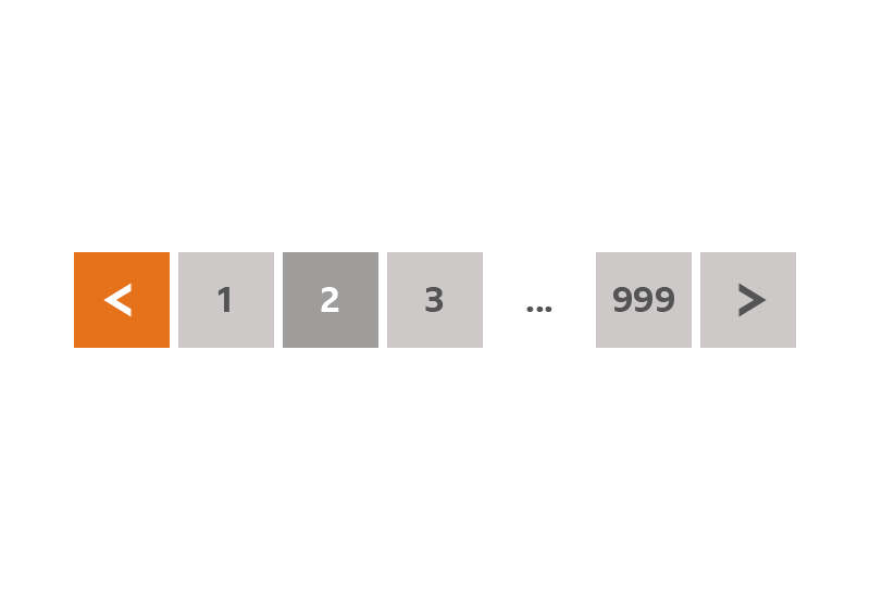
An example of how our numbered pagination is presented.

How it works

The pattern is made up of chevrons to navigate forwards and backwards, and numbered page buttons.

Selecting the right chevron moves you one page forward.
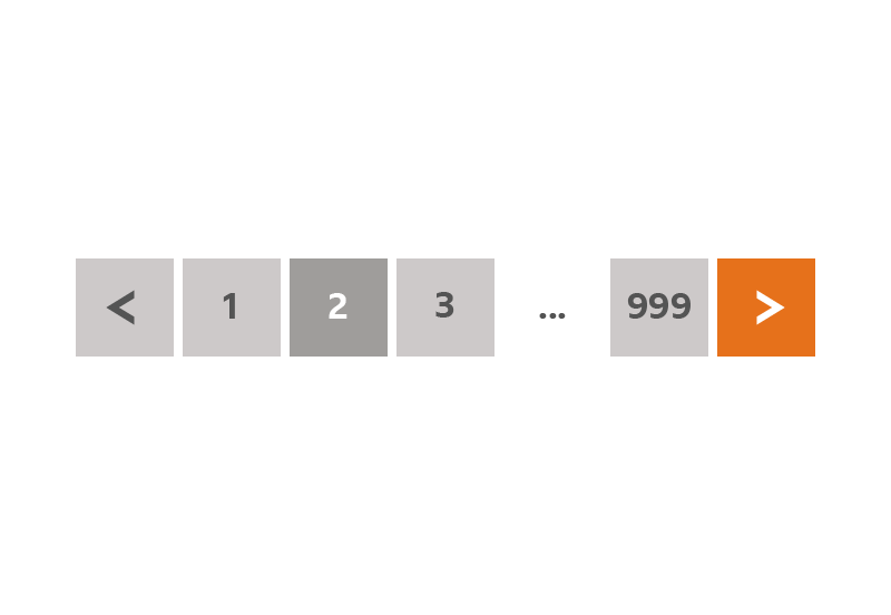
An example showing the right chevron being selected.

Selecting the left chevron moves you one page back.

An example showing the left chevron being selected.

You can jump to any page by selecting a page number button. We use an ellipsis (…) to show that more pages exist.
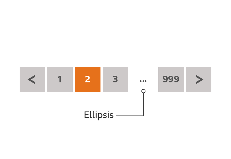
An example showing a single page number being selected, and highlighting the ellipsis.

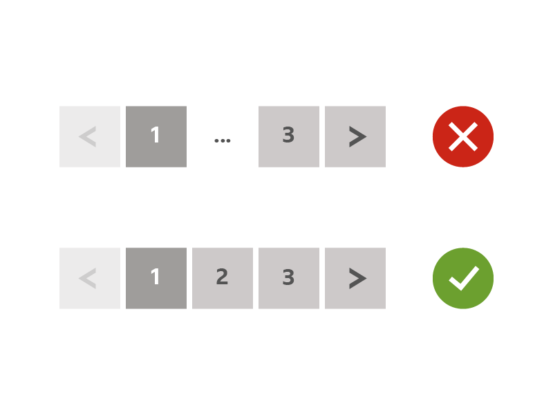
If there’s only a small number of pages, show all the page buttons without an ellipsis.

An example of numbered pagination with a small number of pages.

Rules

  • -  You can use numbered pagination at the top and/or bottom of any page. We recommend you centrally align the pagination.
  • -  You should always have left and right chevron buttons.
  • -  The page number you’re on is always highlighted.
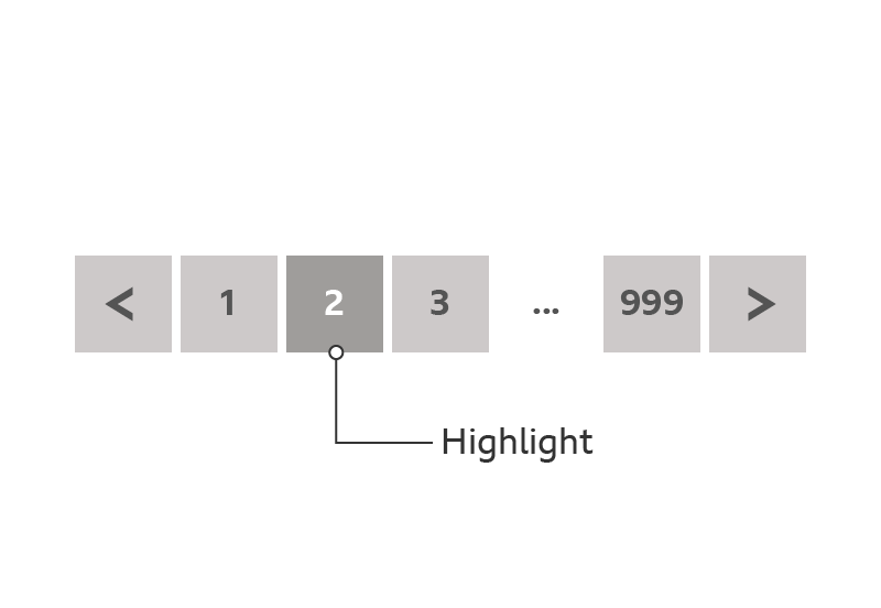
An example of a highlighted page number.
  • -  An ellipsis shows there are further pages. The ellipsis is not interactive.Always show the first page number button.
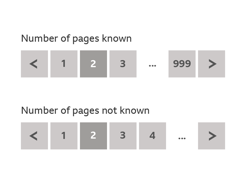
  • -  Also show the last page number when we know how many there are. When we don’t know how many pages there are, replace the last page number with an ellipsis.
An example showing the difference between the last page number being known.
  • -  When you’re on the first page the left chevron is inactive. When you’re on the last page the right chevron is inactive.
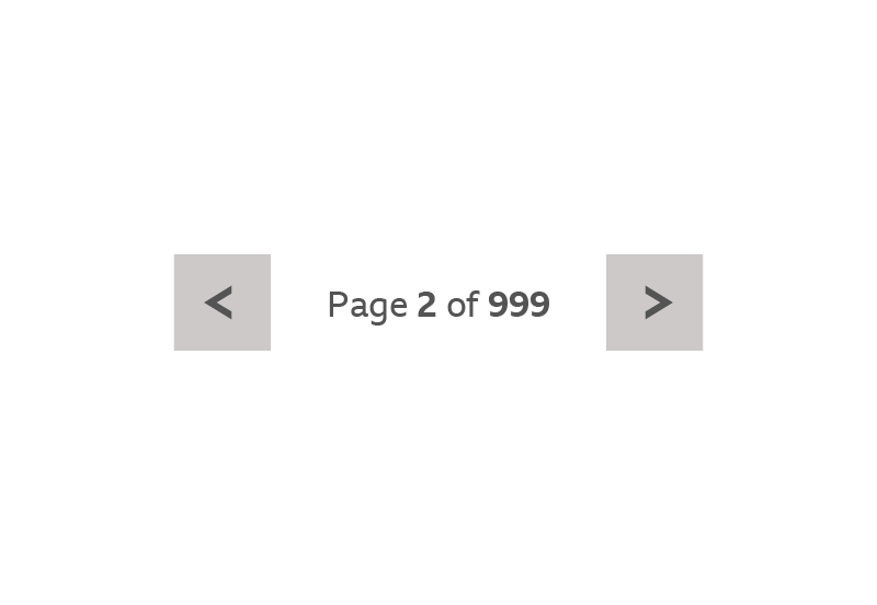
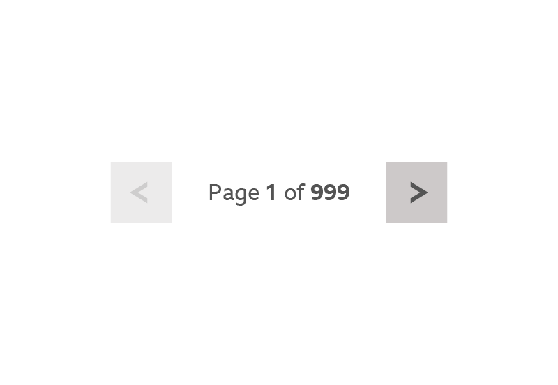
  • -  On screen widths below 320 pixels we don’t show any numbered page buttons. Instead we display text showing the page information.
An example showing numbered pagination below 320px.

Accessibility

  • -  Use ‘alt tags’ for chevrons if they’re images, or ‘title tags’ if they’re ‘Scalable Vector Graphics’ (SVGs).
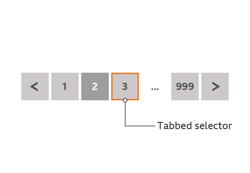
  • -  The tabbing order through the pagination should be left to right. The ellipsis is not interactive, so tabbing should skip past it.
An example of tabbing through page numbers.